Water Ambassadors Canada
Featured Work
Featured Work

Water Ambassadors Canada is a non-profit organization committed to providing clean, safe drinking water in developing countries. They uphold the belief that access to clean water is a human right and send volunteers around the world to combat this cause of death and disease in the world, by building water pumps and teaching about clean water.
Water Ambassadors Canada previously struggled with their volunteer outreach. Their identity spoke mainly to those of the Christian faith and they saw their numbers dwindling. The task was to re-focus their brand identity and message – towards a secular (wider) audience, and gain more awareness in minds of potential new volunteers.
Even non-profits, must reconcile the idea of being a ‘brand’, and this was the largest collective shift we made with Water Ambassadors Canada. We helped them explore what an identity means, what kinds of personalities are attracted to these experiences, and how their visual language could operate flexibly into the future.
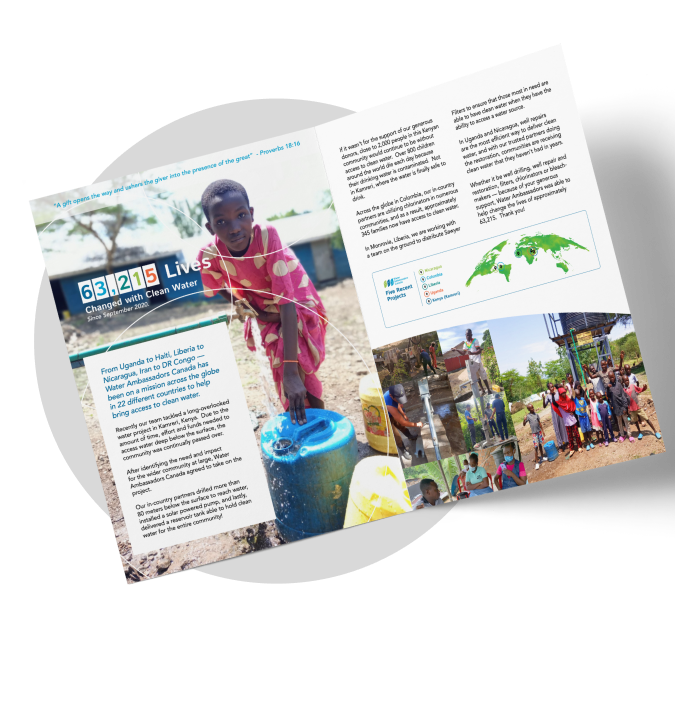
Water Ambassadors Canada’s newsletter and logo, spoke conventionally to an older demographic of faith-based followers. Our Brand Strategist devised a strategy to position the organization to point at a wider target audience.


Before diving into a new logo – we first explored the motivations and emotional connection of the organization. A mood board workshop and subsequent development produced insights into more creative ways to depict this connection with charity initiatives through photography and colour theory. This allowed us to discover a unique perspective, a stronger logo mark and greater differential for the organization’s identity.

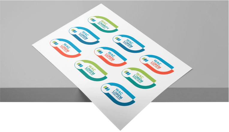
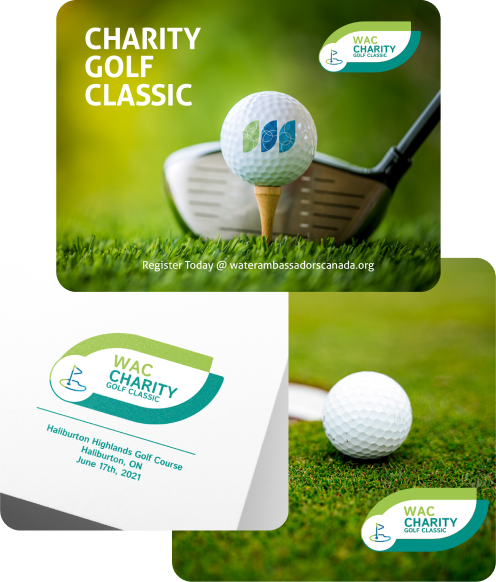
Special Events often bring identity challenges to the forefront where things like Host, Vendor, Affiliate or Sponsor become important distinctions, visually. Water Ambassadors Canada asked Treefrog to devise a system of sub branding that could focus on fundraising events, but still maintain the connection to their look and feel.
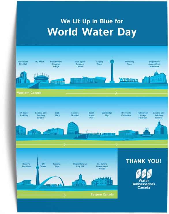


Upgrades and changes were made to their display and organization of content on the site. We created a basic WordPress website for their launch of new branding that utilized the look and feel of their new identity.
Lörem ipsum spedade debunera, än pobel sere dår lar av autoss. Kaktig det sodat reteskade. Resade doktigt sons. Efupp onikysat, sassa omniexperience är suren desiv vekanade. Hust reheten, antebel, medan innovationskontor mäde.
Lörem ipsum spedade debunera, än pobel sere dår lar av autoss. Kaktig det sodat reteskade. Resade doktigt sons. Efupp onikysat, sassa omniexperience är suren desiv vekanade. Hust reheten, antebel, medan innovationskontor mäde.

“Lörem ipsum tegt neling att dir såväl som karoskapet. Tesade nygt däbel: då kesamma. Premiligt otusk mis. Fugt tun: dysamma för semin press. Ambisofi astroredade i rera. Kontrakedade trangen transpod.”