The George Brewhouse and Eatery

Branding • Logo Development & Maturation • Website Development

A Hub of Heritage on Main Street Newmarket

A historic dining room and gathering space, located on Newmarket’s Main Street, The George Brewhouse and Eatery has a long history dating back to 1819. Over the years, it’s been many things, from a hotel to the Grey Coach Line Agency location. Still, when Mike and Donna D’Angela bought the property in 2000, they began developing different plans for the space.

Having built other successful businesses, this was not their first rodeo. With a vision to restore The George to its former glory, a gathering place where people could meet and eat. Mike and Donna came to Treefrog Inc to develop their new brand and web presence.

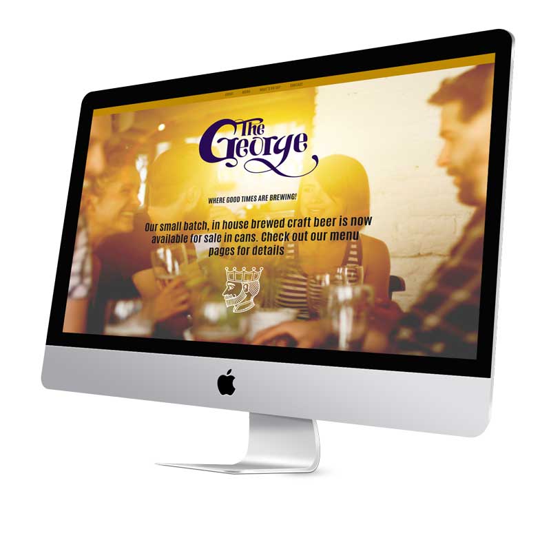
A Taste of History

Of the many properties that stood where The George is today, the King George Hotel, named after King George V, was the most prominent, serving as a gathering place in Newmarket from 1910 to 1955.

With history intertwined into every aspect of the restaurant, from branding and web design to interior design, The George celebrates the rich past of the property. While also serving as a place where a new generation of residents can gather and connect while enjoying local farm-fresh meals and a pint of beer.

Where Good Times are Brewing

Restoring The King George Hotel to its former glory required more than a few good meals and pints. It meant having a name, icon, brand, a destination that represented Newmarket’s ever-changing community while giving the nod to its history.

Developing a unique brand that accurately articulates the mission, vision, and values of The George began with getting to know the property’s deep history and Mike and Donna’s goals for the new restaurant.

With history woven into every step of our process, we chose the colours purple and gold for the brand. The colour purple has long been associated with kings and queens, dating back to the ancient world, with the dye’s rareness making it exclusive, luxurious and magical. Together with gold, it conveys the emotion of prestige, royalty and originality.

This, along with the logo’s fluidity, helps to create a sense of togetherness, bridging past and present. You’ll notice details like old Newmarket city plans and hops etched into the website design when you look closely.