

Development

A rocky waterfall
Digital Marketing, Web Design & Development

Increase Your Google Page Speed Score Part 1: Start With The Basics!

With Google putting an emphasis on high quality content for users in the last few years, there’s been a big push to focus strictly on content marketing. Where the first optimizers started off by taking advantage of search engine algorithms through pure coding, nowadays, producing high quality content has been the primary goal.

And absolutely…content really is important. A website without high quality content is just an empty shell with no pearls. However, as search engine optimizers, it is essential that we don’t lose focus on the technical aspects either and that we also give this side of SEO the attention it deserves.

…which brings us to PageSpeed.

Speedy Content

Part of producing high quality content includes delivering it to users with lightning speed. No one likes clicking on a link only to wait for more than 5 to 10 seconds for the page to load in full. By then, they would probably have left your site: increasing your bounce rate, reducing time on site and affecting your overall user engagement. All these things can impact your keyword ranking.

With more “Google searches taking place on mobile devices”, ensuring your website operates with lightning speed is essential.

Google PageSpeed Insights

There are many page speed test tools out there that can help ensure your website performs optimally in speed. Tools such as KeyCDN, pingdom and GTmetrix are great for really analyzing and optimizing your website. But for the purposes of this blog post, we’ll be taking a look at Google PageSpeed Insights.

There are various differences to how Google PageSpeed Insights work versus other page speed tools. For one, it doesn’t actually measure loading time. Rather Google PageSpeed analyzes several different components of your page and gives recommendation on how to improve its performance based on time to above-the-fold load and time to full page load.

As such, there is much debate within the SEO community on whether or not it’s even worth achieving a high PageSpeed score. Some trade offs may occur when trying to achieve a high score (i.e. certain techniques to decrease render time can actually decrease your PageSpeed score). We’ll save the usability and reliability of Google PageSpeed Insights for a later post as this topic requires a much more thorough discussion.

Having said that, Google has the largest market share in search engines. It’s still a good idea to consider these recommendations in conjunction with using other speed tools to compare loading/rending and server response time measurements.

Google PageSpeed Insights Rules

Google PageSpeed Insights is split into two rules: speed rules and usability rules. Since our focus is on speed, we’ll take a look at the speed rules exclusively. The speed rules include the following:

  • Avoid Landing Page Redirects
  • Enable Compression
  • Improve Server Response Time
  • Leverage Browser Caching
  • Minify Resources
  • Optimize Images
  • Optimize CSS Delivery
  • Prioritize Visible Content
  • Remove Render-Blocking JavaScript
  • Use Asynchronous Scripts

Some of these recommendations will require their own blog post as there are many factors to consider before implementing. For example, improving server response time requires a much more thorough thought process. So we’ll be highlighting the items that are fairly simple to complete.

1. Avoid Landing Page Redirects

Ensure your landing page is not a redirected page. Landing page redirects can hamper the user experience if its takes too much time redirecting to multiple pages. This is especially important for ads, links, and social links pointing to a specific landing page.

What to do:

The best and easiest thing to do in this case is to update all your ads, links and social links so that they are pointed to the correct landing page (i.e. their final destination).


Note: The following recommendations below assume you fully understand server software programming, HTML, JavaScript and CSS programming. If you aren’t too sure of these techniques described, give us a shout and we’ll help you out!


2. Enable Compression

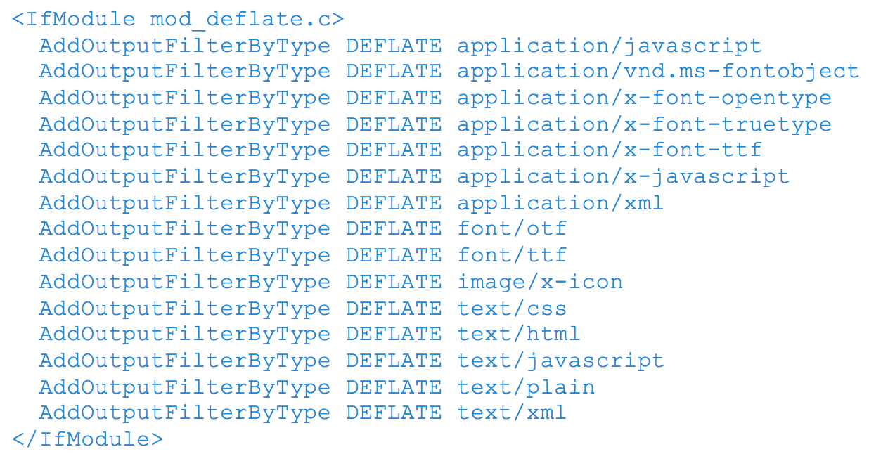
Ensure your compressible resources are served with gzip compression. “This can reduce the size of the transferred response by up to 90%”, reducing the download time for users when they visit your page.

What to do:

Most web servers in the world use Apache as their server software. There are others such as nginx and IIS. I personally have only had to deal with Apache servers so far and you are likely dealing with it too. (Tip: One way to check is to use Google Search Console’s Fetch as Google tool and look at the fetch details)

Assuming your server uses Apache, to enable gzip compression, you’ll need to use the Apache Module mod_deflate. Depending on the file types you want to compress, insert the following into your .htaccess file:
3. Remove Render Blocking JavaScript

Ensure there are no HTML references to external JavaScript files in the above-the-fold portion of your page. When your browser sees a script in the document, it pauses DOM construction and executes the script before proceeding. Therefore, your above-the-fold content can not be rendered without waiting for the JavaScript resources to load. In other words, avoid placing any JavaScript in the header as it may cause a delay in rendering your page.

What to do:

  • If the JavaScript resource is fairly small in code, you can inline the script contents into the HTML document. The drawback however is that you are now making the HTML document larger in size with extra JavaScript code.
  • You can apply asynchronous JavaScript to avoid parse blocking the DOM construction. To achieve this, mark your JavaScript with async

You can also avoid the JavaScript from running altogether until the DOM construction is complete by deferring the script. To achieve this, mark you JavaScript with defer.

Another way to defer, is to simply put your JavaScript in the footer of the HTML

4. Optimize CSS Delivery

In the same manner as removing render-blocking JavaScript, ensure there are no HTML references to external stylesheet files in the above-the-fold portion of your page. Similar to JavaScript, CSS are render-blocking resources. Therefore, your above-the-fold content cannot be rendered without waiting for the CSS resources to load.

Unlike JavaScript, defer and async do not work on CSS files.

What to do:

  • If the CSS resource is fairly small in code, you can inline the script contents into the HTML document. The drawback however is that you are now making the HTML document larger in size with extra JavaScript code.
  • The one solution that’s worked for me so far is using JavaScript to defer CSS from loading. Courtesy of www.giftofspeed.com, insert the following code into your HTML footer (replace yourcssfile.css with your actual CSS file).

Place the following snippet within your HTML header. This ensures browsers that don’t support JavaScript can still load CSS files.

What Are You Waiting For? Get Started!

I’ll be saving the rest of the recommendations for a next blog, since they require a little more context and discussion. But these four recommendations are a good place to start optimizing for Google’s PageSpeed Score …assuming you have a good understanding of servers, HTML, CSS and JavaScript.

In the tests we’ve conducted, enabling compression alone increased our PageSpeed Score by 22 points for mobile and 24 for desktop – quite a big jump. Even with trying out these four recommendations, you could significantly increase your PageSpeed score right now.

As a last note, every website is different and there are little nuances that make your website unique, so its very important to test these recommendations first before implementing them right away. With that being said, try testing these recommendations and let us know how it worked out for you!

Thanks for reading! If you have any questions or comments, feel free to comment below! We’d love to hear your thoughts, feedback and/or grievances!

Resources

Gold ore
Mobile App Development

4 Ways to Make Money with Your Mobile App

Deciding which monetization model best suits your branded application depends on many factors

Like the moneyed prospectors who raced northwest to the Yukon’s Klondike region in the late 1800s in search of fortune in the form of gold, the modern equivalent of the gold rush may be the desire of businesses and independent developers to create a new revenue stream via a mobile application. But like the Klondike gold rush, not everyone will end up hitting the jackpot.

Conceivably, finding a way to make money from a mobile app is similar to the plight of social media marketers to generate sales through the use of compelling content, in that it comes down to a question of user engagement.

There are different ways to generate revenue through a mobile app. Deciding which model to adopt and what to charge your targeted audience may be the most taxing call you will need to make. But here’s food for thought: according to research by Statistica, the most profitable option is the in-app purchase. In 2012, global in-app revenues were an estimated to be US$2.11 billion and are predicted to rise to $36 billion by 2017. However, the in-app model may not be the lucrative windfall for all types of apps, with about 15% of smartphone users making such a purchase.

Four App Monetization Models to Consider

In general, apps have four major channels available for generating revenue. Determining which model you should employ depends largely on the type of app you have or intend to build, and what your expectations are for user engagement:

  1. Charging to download it from the Apple App Store or Google Play.

    Provided your app offers something of value to your customers, then you can monetize it by charging people to download and use it. However, you should also know that Apple and Google will take approximately 30% of every sale or download, and the cost you can affix to your app must be based on either Apple’s or Google’s pricing scales.
  2. Using mobile ads banners and offering an ad-free version of your app.

    Instead of charging your users to download and use your app, you can sell advertising space in it like many newspaper companies do, and subject your users to mobile ads banners within the app. You can also charge your users for an ad-free version of the app, but know that Apple and Google will take 30% of what you charge your users for an ad-free version of your app.
  3. In-app purchases.

    While allowing your app to be downloaded for free, in-app purchases are purchases your users make inside of your mobile app. The items they purchase could be to access additional features of the app, or for virtual items to use within your app. For instance, many gaming apps provide in-app purchases so their users can buy special characters or abilities within whatever game they’re playing. It is currently the most successful way of making money with an app. You should also be aware both Apple and Google will take 30% of all in-app purchases.
  4. mCommerce or mobile commerce.

    Whereas we refer to selling products and services online as “eCommerce”, selling goods or services via a mobile device is known as “mCommerce”. The good news with mCommerce is neither Apple nor Google will impose a 30% cut for whatever products your users buy via your app. However, a mobile app with mCommerce functionality also requires a backend server for things that can’t be done solely on-device, such as sharing and processing data from multiple users, or storing large files. You will also need a payment processor to facilitate debit or credit card payments.

Other App Economic Options

There are a couple of other options to consider for your app: the freemium model, and the use of a paywall.

The freemium model is often found on gaming apps such as the wildly addictive Candy Crush, which allows users to play for free, and offers gamers the option of purchasing in-game features or an interruption-free version of the game. You’re not obliged to purchase anything in this game, but it will impose a short-term time-out on its users after they hit certain game milestones. For gaming apps, the freemium model has proven to be the most successful type to date, suggests data from mobile marketing and engagement firm Swrve.

The other option – one that’s typically used by newspaper and magazine publishers to generate subscription revenue – is the paywall. Similar to the freemium model, paywalls let users access a fixed amount of content for free before restricting access, and asking them to buy a subscription. The problem with the paywall model is unless you’re in the publishing business, it may not apply to your company or industry.

Are you curious if your business should create its own mobile app and how to monetize it? Zap us. Our knowledgeable and talented development team can bring your mobile app concept to fruition.

Geometric metal ceiling
Web Design & Development

What is Web Design?

Design is the process of collecting ideas, and aesthetically arranging and implementing them, guided by certain principles for a specific purpose. Web design is a similar process of creation, with the intention of presenting the content on electronic web pages, which the end-users can access through the internet with the help of a web browser.

Elements of Web Design

Web design uses many of the same key visual elements as all types of design such as:

Layout: This is the way the graphics, ads and text are arranged. In the web world, a key goal is to help the view find the information they seek at a glance. This includes maintaining the balance, consistency, and integrity of the design.

Colour: The choice of colours depends on the purpose and clientele; it could be simple black-and-white to multi-coloured design, conveying the personality of a person or the brand of an organization, using web-safe colours.

Graphics: Graphics can include logos, photos, clipart or icons, all of which enhance the web design. For user friendliness, these need to be placed appropriately, working with the colour and content of the web page, while not making it too congested or slow to load.

Fonts:  The use of various fonts can enhance a website design. Most web browsers can only read a select number of fonts, known as “web-safe fonts”, so your designer will generally work within this widely accepted group.

Content: Content and design can work together to enhance the message of the site through visuals and text. Written text should always be relevant and useful, so as not to confuse the reader and to give them what they want so they will remain on the site. Content should be optimized for search engines and be of a suitable length, incorporating relevant keywords.

Creating User-Friendly Web Design

Besides the basic elements of web design that make a site beautiful and visually compelling, a website must also always consider the end user. User-friendliness can be achieved by paying attention to the following factors.

Navigation: Site architecture, menus and other navigation tools in the web design must be created with consideration of how users browse and search. The goal is to help the user to move around the site with ease, efficiently finding the information they require.

Multimedia: Relevant video and audio stimuli in the design can help users to grasp the information, developing understanding in an easy and quick manner. This can encourage visitors to spend more time on the webpage.

Compatibility: Design the webpage, to perform equally well on different browsers and operating systems, to increase its viewing.

Technology: Advancements in technology give designers the freedom to add movement and innovation, allowing for web design that is always fresh, dynamic and professional.

Interactive: Increase active user participation and involvement, by adding comment boxes and opinion polls in the design. Convert users from visitors to clients with email forms and newsletter sign-ups.

Treefrog’s Toronto web design professionals create excellent User Interface (UI) Design for a satisfying web experience. They use critical planning and analysis for the design and they pay attention to individual client specifications, converting the intricate process into a simple and elegant piece of art.

Man making an online purchase on his computer tablet
Digital Marketing, Web Application Development, Web Design & Development

Choosing the Right Small Business E-Commerce Solution

Should you integrate an out-of-the-box hosted platform with your website? Or is a customized on-premise solution a better option?

Your website is a contemporary extension of your business but with more important details about you, your employees, and how your products and services help solve your customers’ problems. In a hyperconnected world fuelled by e-commerce, the onus is on business owners and leaders to determine what the best e-commerce solution is to build into their sites.

Whether your company focuses on the business-to-consumer (B2C) or business-to-business (B2B) market (or both), the questions you need to answer are the same: Should you pick a hosted, out-of-the-box software-as-a-service (SaaS) solution? Or go for a more customizable on-premise platform?

Whichever way you choose to go, the solution should be a unified, user-friendly platform that is scalable and which integrates an online store with accounting, point-of-sale, inventory and subscription management tools, and other finance-related functions.

There are, of course, a number of elements you will need to consider, including:

  • If taxes are based on the location of the shipping warehouse or the shipment’s destination
  • Are shipping charges determined by a package’s weight, size, or destination? Or do you charge a flat fee?
  • Inventory control and management
  • Do you need to connect point-of-sale systems from bricks-and-mortar locations?
  • Cross-border customs clearance
  • Fluctuating currency exchange rates
  • Product discounts or seasonal specials
  • Overall reporting and metrics

“Here is a simple but powerful rule: Always give people more than they expect to get.”
– NELSON BOSWELL

Which E-Commerce Platform Is Best for Your Business?

When it comes to picking an e-commerce solution, the good news is there are options aplenty.

For most small businesses on tight budgets, Shopify has emerged as one of the most popular. Treefrog has integrated Shopify’s and other platforms with many of our clients’ sites, but we also provide custom-built e-commerce solutions.

Although Treefrog can integrate your site with any e-commerce platform you want, most of our clients that have selected a hosted solution have chosen one of the following platforms:

  • Shopify. Possibly the most popular and widely used e-commerce and shopping cart platform used by small- and medium-sized businesses today, this Canadian company’s solution features a broad range of options. It is easy to set up, has an intuitive user interface, add-on apps, 24/7 support, and its API integrates seamlessly with enterprise resource planning (ERP), customer relationship management (CRM), and other software.
  • Volusion. This platform features a comprehensive set of shopping tools, round-the-clock support, a user-friendly interface, extensive security features, and a mobile-responsive storefront. Volusion integrates seamlessly with Amazon and eBay, and through its social store builder tool, you can list your products on Facebook. It’s scalable, but the basic version sets a limit on the number of monthly transactions by restricting bandwidth, meaning service charges may apply if you exceed it.
  • Bigcommerce. This feature-rich solution includes many customizable templates, is easy to use and has an intuitive user interface, 24/7 support, no transaction fees, and has smooth integration with several e-newsletter services and Alibaba. It too is mobile-responsive and provides in-depth metrics and reporting.
  • Magento CE. An open source e-commerce platform that is available in four variations, the Magento Community Edition is an out-of-the-box solution that you must host on your server, or with its partnering company, Zoey. It includes bundled features including smooth integration with Google Analytics, in-depth sales reporting, and many third-party integration options but it is not PCI-compliant. Existing small business users provide community-based support.

Additional Things to Consider for Your Website

Once you’ve determined which e-commerce solution suits your business best, and taking a 360-degree view of your company and its online presence, there are other considerations to weigh:

  • A payment gateway. If you’re going to establish an online e-commerce platform, you will also need a payment gateway to facilitate online credit and debit card transactions. A payment gateway is an e-commerce enabler. It’s vital, and it provides a secure link between your site and the banking system. In essence, it provides a merchant-centric, single, automated portal to manage online financial transactions cost-effectively, quickly, and easily. It also makes it easy and flexible for your customers to buy from you online.
  • Readable, compelling content. If “content is king” then context must be queen. The importance of producing content online regularly cannot be denied, but to be regarded as a thought leader in your industry, your content needs to be persuasive, well-written, and it must provide value to your intended audience, or they will pay it no mind.
  • Search engine optimization (SEO). A widely used methodology to drive website traffic organically through the use of high-quality content, SEO maximizes your site’s content to rank well in search engines like Google, Bing, and Yahoo!.
  • High-quality images and design. There is no shortage of cheap, do-it-yourself (DIY) website builders available online promising anyone can create a professional-looking site in mere minutes for free or for only a few bucks. Lest we forget, you most often get what you pay for in this world. A well-designed website with high-quality images lends credibility to your business. A less-than-stellar online presence will hurt your business, not help it.
  • Using social media tools. More than 2 billion people use social media networks like Facebook, Twitter, YouTube, and LinkedIn on a daily basis. Since sales success requires cultivating relationships, your website should incorporate the use of social media tools, and social media marketing should be a part of your overall marketing efforts. Social tools will also help drive traffic to your website.

Do you have questions about e-commerce platforms and which one is best for your business?  Let’s talk. We can help you determine whether or not you need a custom-built solution or an off-the-shelf platform. Our expert programming team have experience customizing and integrating several e-commerce solutions with our clients’ websites.

Close up of hands holding a mobile phone
Branding & Design, Digital Marketing, Web Design & Development

4 Reasons Your Email Unsubscribe Numbers Are on the Rise

Are you taking a ‘megaphone’ approach to your email marketing campaigns in an effort to reach as many people as possible? The key to keeping your customers engaged comes down to sending targeted messages at precisely the right time

It’s the winter and a weeklong cold spell has you shivering. Snow and ice are everywhere. As an icy wind freezes your face while you stand outside waiting for a bus to arrive, you feel your mobile phone vibrate in your pocket. You peel off one of your gloves to check your messages only to find you’ve received an email about ice cream, frosty milkshakes, and frozen desserts.

You wouldn’t think a company would send such an ill-timed and poorly targeted marketing message, but it happens more often than not, and it typically prompts the recipient to hit the “unsubscribe” link in fine print at the bottom of that email.

Irrelevant messaging is a significant driver of unsubscribe rates, and importantly, it’s an annoyance to your customers. According to IBM Silverpop’s annual global report on email marketing dubbed, “2015 Email Marketing Metrics Benchmark Study”, Canadian brands posted markedly lower email opening rates compared to companies in the U.S., U.K., the Asia-Pacific region, Europe, the Mideast, and Africa. It could be because of many reasons including consumers are quick to delete emails that don’t resonate with them immediately.

In addition to the content of marketing communications, the format of marketing emails may also be a factor. A study by Litmus found nearly half of emails are now opened on either a smartphone or tablet. That’s a dramatic increase from 2011 when only 8% of emails were opened on a mobile device. In light of this finding, marketers would be wise to adopt a mobile-friendly approach to the content and design of their emails, and they should reduce the number of calls-to-action to one or two per email.

When Email Open Rates Slide and Unsubscribes Spike

Though your email open rates data shouldn’t be used as a sole indicator of a marketing campaign’s success or failure, it is a useful metric to measure. Your email subscribers are valuable. Reducing email list churn is dependent upon understanding why existing and prospective customers unsubscribe from your communications.

After spending the effort (and money) to get your customers to opt-in or subscribe to your marketing emails and to keep them engaged, it is disheartening and frustrating to see unsubscribe levels increase. Outside of irrelevant messaging, there are four primary reasons why people are unsubscribing from your email lists:

  • You’re emailing them too often. When was the last time you heard someone complain they don’t receive enough email? Determining what the right frequency is to send your subscribers an email is multifaceted, but it comes down to the size of your list, the quality of your email content, and the unknowable: how receptive your subscribers truly are to reading your emails.
  • Your emails aren’t smartphone-friendly. Email remains the most effective and affordable digital marketing tool at your disposal to reach your customers, but are you crafting and designing your marketing emails for mobile device readers? With an estimated 68% of all emails in 2015 opened on a mobile device (tablets comprise about 16% of that total) versus on a desktop, it’s wise to assume your emails will be read on a smartphone.
  • All you do is try to sell to them. Are you hitting people over the head with an unending stream of “buy this!” type of content? It’s good to make your customers aware of current and upcoming promotions, but if all you’re doing with your email marketing content is pushing your recipients to purchase something, they’ll start to tune you out.
  • Your content is repetitive and uninteresting. If your email content triggers déjà vu in your audience, or it’s merely uninspiring drivel that serves no real purpose, all you’re succeeding at is inviting people to hit the unsubscribe button.

“The aim of marketing is to know and understand the customer so well the product or service fits him (or her) and sells itself.”
– PETER DRUCKER

Zeroing in on Targeted Messaging

Not all of your marketing communications will be relevant to all of your customers, so choose smartly, and don’t lose sight of your marketing campaign objectives. Keep these key points in mind before you hit the “send” button:

  • Define your target audience. Knowing who to market to and why will dictate the success of your email campaigns. You need to understand who has a need for your product or service, who is most likely to purchase it, and what’s most appealing about it to them.
  • Be specific. Your brand is at the heart of your messaging, so narrow down what it is you’re trying to tell your audience and clearly state it. Are you trying to get them to purchase something new? Are you attempting to provide advice? Or are you wanting to draw attention to something your company has done for the betterment of the local community? Avoid emailing mixed messages; they only lead to confusion (and the virtual trash bin).
  • Tailor your messages per channel. Don’t clone your marketing messages. In other words, whatever messaging you use in an email, shouldn’t be the same messaging you have on your website, use on your social media channels, or have printed on brochures. Particularly now in the age of mobile computing, you need to strategize how best to reach your targeted audiences via varying avenues or mediums and customize your content accordingly.
  • Timing is everything. Use your customer data to determine the best time of day to send your marketing emails. If you do, in all likelihood you’ll see a high number of emails opened, and the links within it clicked. Moreover, you won’t annoy your recipients by sending them an email in the winter about ice cream.
  • Get permission first. The most important point to remember is to make sure you have every recipient’s permission orally or in writing (electronic consent is acceptable) before you send them any marketing-related email. Moreover, take steps to protect your customers’ privacy. You should also make it simple for anyone to unsubscribe from or opt-out of your emails. Nobody likes to be spammed. And lest we forget, Canada’s Anti-Spam Legislation (CASL) expressly forbids companies and marketers from engaging in such shady practices. CASL applies to all forms of commercial electronic messaging, not only email.

One last noteworthy point on the subject of CASL: According to the Canadian Marketing Association, July 1, 2016, marks CASL’s two-year anniversary, and it’s the deadline for two-year implied consent agreements to expire. That means you need to ensure you have permission for all of your electronic messages (emails, texts, etc.) from your list of recipients unless you have an existing business relationship with them. It’s also important to be mindful that as of July 1, 2017, Canadian citizens will have the legal right to sue organizations for CASL violations.

Want to learn how to create more sales leads via email marketing? Let’s talk. We can help you create meaningful content for your subscribers, develop a strategy for cultivating an effective email list, and analyze the performance of your campaigns.

Woman holding a coffee mug
Web Design & Development

Working With Web Designers

After first feeding them a latte…

So you’ve decided that you need a website, and you’ve started the gears turning with the Frogs (or, perish the thought, another agency entirely). Maybe you’ve done some sketches on a cocktail napkin and now you’re ready to start working with the graphic designer assigned to your project. You’re on your way to having a beautiful new website design.

For any designer, the process is clear and simple, but it may be new to you so here are a few tips to help you understand what’s happening so that you can develop a fruitful and stress-free relationship with your designer.

You’re paying for experience

You may have heard of Photoshop and even used it once or twice, but there are people in the world who have forgotten more about Photoshop than most of us will ever know. These are design professionals – the ones who work with Photoshop day in and day out, learning the intricacies of the software and understanding how to craft a piece of art with nothing more than a keyboard and a mouse.

It’s this expertise you’re paying for when you hire a graphic designer to artfully construct the look of your website – not just knowing Photoshop, but also understanding a variety of software, design philosophy, how to draw a user’s eye to important visual and textual concepts, and that you never wear brown shoes with black pants.

A designer has spent years learning about design and what looks good, but when you’re paying good money for a website and you think of it as your baby, it can be difficult to step back and let the designer do the job you’re paying them to do. To make the relationship as smooth as possible, though, there’s a point where the conversation about design intent and message is over, and it’s time for the designer to get to work.

A good, experienced designer will be able to recognize patterns of colour and shape, and be able to draw every element of a website’s design together into a piece of art that not only gets the point across but also pushes a viewer to focus in on the most important elements.

Some people want to micro-manage every aspect of the design instead of relying on the professional’s advice, and that’s where problems can start to arise. A designer will put together the best design they can, based on the client’s needs and objectives. While a client may not love it at first sight, it will be professional and will be based on the information the designer was given.

“A good designer will bring their many years of training and experience together to build an excellent website – something that fits the objectives”

Getting that one version

Clients may be surprised when they only get one version of a website design instead of several to choose from. This is the complete opposite of what they get when a designer creates a logo (typically a few different ideas are presented based on the client’s needs).

With a website, though, a designer doesn’t need to generate several ideas. In fact, that’s a lot of extra time and money that doesn’t need to be spent. A good designer, with an understanding of the client’s brand and intent, will bring their many years of training and experience together to build an excellent website – something that fits the objectives. They’ve gone through a variety of versions in their head and come up with the best result.

“I think the main thing is just trust our expertise and knowledge,” says Jen Hawkyard, Treefrog’s art director. “I think what happens a lot of times is people come in with the ‘this is the way I think it should be done attitude’ and aren’t listening to the advice and expertise that we have. We do things for a reason and it’s not haphazard.”

To get the most from the relationship with the designer, clients should ideally listen to the designer’s advice. It’s okay to question the advice; it means you’re interested and invested in the project. However, there are reasons designs are done in a certain way.

As Jen explained, web design is very intentional. Designs make a user’s eyes follow a very specific path, leading them to see key attributes – all based on what a client says is the most important parts of their business. As long as that information is accurate, the design is appropriate.

The Dos and the Don’ts

Do you want to make things as easy and seamless as possible during the website design process? It’s not as hard as you might think. Here are a few tips from the Frogs that will make your life easier and help you get the design you really want:

The Dos

  1. Do understand you’re paying for a professional instead of your nephew who “knows something about computers.”

  2. Do listen to the advice of the designer. They’re professionals with mucho experience and talent.

  3. Do be very clear about your objectives and brand identity. If you want things to run smoothly, it’s important that the designer knows where you’re coming from and what you want.

  4. Do use the designer for the appropriate task. You wouldn’t use a hammer like a screwdriver. Use the designer for their expertise.

  5. Do trust and relax. Treefrog looks for the best talent. They know their jobs, and they’ll do a fantastic job if you let them.

The Don’ts

  1. Don’t micro-manage. Nobody is at peak performance with the boss hanging over their shoulder. Let the designer do the job they were hired to do for you.

  2. Don’t treat the designer like a layout person. They went to school for their job and spent years doing it. They know what looks good, and they’ve already thought of alternatives. They’ve chosen what is best based on your objectives.

  3. Don’t keep tweaking excellence. Once the design is excellent, don’t keep tweaking in the hopes of getting perfection.

  4. Don’t hire a designer if you want a computer operator. You’re spending a lot of money to get good graphic design and a designer’s professional advice. Don’t worry, be happy. The designer will come back with a website design tailored to your needs. If you communicate those needs well, the design will be in line with your business goals.


A blue chameleon.
Web Design & Development

Is Your Website Truly Responsive?

Since Google’s famed mobile-friendly algorithm update this past April, everyone has been jumping on the responsive bandwagon.  To make mobile users happiest, Google suggests having a responsive website. Of course, making your website responsive is not like flipping a switch. A lot can go wrong. And it often does.

Exactly what goes wrong, you ask?

Check out these most common issues with responsive design.

Does your logo resize and rescale correctly?

Your logo is the pinnacle of your brand. It should look great on all devices to best represent your business and start the conversation with your clients. If your logo looks blurry, too big, too small, cut off, or broken in any way – speak to your web team about getting it fixed right away.

Are your icons retina-ready?

Icons are hugely helpful for helping users navigate on the smaller mobile devices. They are often used to replace lengthy words to save space – and since we respond quicker to visual stimuli than we do words it makes for a quicker viewer and user experience. Are your icons blurry rather than crisp? With the multiple resolutions that laptops, tablets, and mobile devices come in nowadays it’s a wonder anyone can get image formatting right. But if your web team is a team of experienced professionals they should be able to manage multiple resolutions. If your icons are clear on a laptop but appear blurry when viewed on a mobile phone, it’s a sign that your mobile site is unable to handle responsive images. With a little work, your icons can be retina-ready!

Can you tap to call?

Seems like a simple question, but it can make or break a user’s mobile experience.  With the rise of smartphones, users are moving their viewing habits from desktop to mobile. Did you know 82% of Canadians use their smartphone for accessing the Internet? From checking out your store hours to booking an appointment, users are relying on the mobile experience for their digital needs. With a little bit of extra code, web developers can ensure that when a user taps your contact number it will call you directly. Similarly, they can also launch a map app to pinpoint your exact location. You can also set up click to call tracking that carries into Google Analytics. Make your client’s life easier by implementing these simple improvements on your responsive website.

Do images scale correctly with the content?

When you move from desktop to mobile, do your images look huge? Do parts of your images seem to be cut off? The mobile experience is a fluid environment and images designed for desktop consumption will wreak havoc on your mobile site.  These images have been assigned a fixed position and will cause mobile mayhem on your beautifully crafted page.

Does the site change when you go into a horizontal orientation?

Depending on your developer, your site will be designed to reflow at certain dimensions. Here at Treefrog our main “break points” are desktop (1024 pixels and up), phone (768 pixels and 320 pixels). We use 480 pixels when a user turns and operates the device horizontally. We also include an in-between dimension that allows a responsive site to reflow naturally and adjust itself to the size of the device. If your site looks the same across all devices other than it looking bigger or smaller, then there is something wrong and the user-experience will likely not be ideal.

Do you have to insert content multiple times?

A content management system (CMS) like Treefrog’s LEAP will help minimize the time it takes to insert content. With a CMS, you will only have to input your content once, and it will seamlessly reflow on all your mobile devices. If you have to insert content for a mobile version in addition to your desktop site your likely do not have a fully responsive page.

Do your call-to-action buttons reflow to match the device?

Depending on the device the user may have different priorities and interests. A tablet has the natural ability to make reading easy and compelling. The size of the screen allows you to prioritize content and include a call-to-action button without sacrificing any space. The mobile device, however, is a different story. Users are often on-the-go and need to find information without the hassle of infinite scrolling. Guide users to the information they need by avoiding visual clutter and creating a dominant call-to-action button—remember space is at a premium here!

“Today’s web developers need to be mindful of user’s data plans, so load times need to be fast. Mobile sites must be tailored to be less data-heavy.”

Be respectful of data

Remember when you would click a link, go get a coffee, read a report, and still have time to rearrange your office supplies alphabetically before the page loaded? Thankfully those days are over, so unless you have dial-up (in which case, our sincere condolences), users expect lightning-fast service on all of their devices. Today’s web developers need to be mindful of user’s data plans, so load times need to be fast. Mobile sites must be tailored to be less data-heavy. Unnecessary clutter that could impede a streamlined experience must be removed.

Was the site tested on the latest devices?

If your site is on its way to becoming responsive be sure to ask which devices your web developers are using to test performance. Ensure that all users can access your site by testing all current mobile devices on all common browsers (Chrome, Safari, Firefox, and unfortunately Internet Explorer). The mobile experience should be seamless no matter which device is being used to access your site.

Is your site finger-friendly?

Today’s information is literally at our fingertips. Users interact with their devices using touchscreens on their phones and tablets—letting their fingers do the browsing. When designing a responsive site, keep in mind that fingers are a lot less accurate than a mouse pointer.  A touch-friendly design includes buttons that are large and easily identifiable. Hover-style functions will have to be removed, as mobile devices are unable to detect these functions.

Given the countless ways that users can access the Internet, it is imperative that you provide them with a user experience that is seamless across all devices. Making your website desktop and mobile-friendly will keep your customers (and Google) happy, and keep you in business!

Glass ceiling with clouds
Branding & Design, Web Design & Development

The $100 Difference

Some things to consider when deciding if the nickels and dimes are worth it

When selecting a web or graphic design provider, sometimes that $100 difference can make all the difference in your decision. When you’re stuck in a rut between providers, be sure to compare “apples to apples”

Consider these possible deal breakers:

1) Template solution OR custom concepts?

A template solution website takes a lot less time and money to build generally, however makes a great difference in the overall impression that your business gives online as well as your site SEO.

2) Outsourced Hosting OR their own servers?

Many smaller web firms sub-out or host your websites on servers that do not belong to them. This often times creates a web of confusion of who has what and where. When comparing the cost of hosting across the board, keep who owns the servers in mind and stray away from subbed-out solutions.

3) Two-Pop-Shop or Team of Professionals?

The reality is that a two-pop-shop firm (of which many exist and come and go each day) does not have the overhead cost of a larger marketing solutions firm, thus the reason for the cost difference in many cases.  But can two people provide the level of expertise and diversity that a firm with a team of designs, programmers, content writing, SEO specialists and admin /support staff can?

4) What happens if all doesn’t go well?

Should the scenario happen where you do select the $100 less company and things should not go as planned, what will the cost be to you to switch firms? Will you have issues getting ownership of the work that you’ve already completed? Will you be able to take what you have and move elsewhere OR will you be stuck?

5) Not a one-night-stand but a marriage

Remember that when selecting a web provider, your relationship will not be a one-night-stand but rather a long term marriage. With this said, it’s important to select a company that not only has been around for a while, but will still be around for you when you need them. Check on the availability and costs of long term support and webmastering.

Country road going into the mountains
Digital Marketing, Web Design & Development

Site Architecture as a Writing Road Map

Find your way to writing brilliant website content

Think of building your website like heading out on the highway for an exciting road trip to new business heights. You have web design experts to help you develop an architecture and design and to manage the programming. Now you need to fill it with content.

Content Writing Road Blocks

Content writing is a massive road block for many a new website owner. If you’ve been procrastinating, you’re not alone. In Treefrog’s experience, this is the number one stage of a web design project where clients get stuck at the side of the road, completely out of gas.

It surprises many – after all, who is more of an expert on your business than you? So why does it happen?

  • You’re so close to your own business, sometimes it’s hard to step back and see things from your client’s perspective.
  • You invest your time in running your business, you don’t have time to write about it.
  • You’re great at running your business. You don’t also have to be great at writing about it.

Site Architecture to the Rescue

There is a way out of the content writing wilderness. You just need the right directions, and you already have them.

Remember that site architecture and wireframe you approved at the beginning of your project? No? You’re not alone there either. The site architecture is not just for designers and programmers. It’s for YOU.

Your site architecture is a list of the pages you want and/or need on your website when it goes live. Like the step by step directions from your GPS navigator, the architecture is a checklist that will take you through your content writing journey.

“Like any map, your site architecture is a guideline. It offers a route to website success through a user friendly structure.”

Changing Content Directions

Like any map, your site architecture is a guideline. It offers a route to website success through a user friendly structure. There are some aspects that need to be followed, but you might find shortcuts or detours along the way that will improve it, as you see how your design and writing come together.

If you proposed a page at the beginning of your project that you no longer need, you have the power to take it out. If you realize you missed something, you have the power to add it in.

Stop and Ask for Directions

If all else fails, trust the experts. Content writers in web agencies not only understand your architecture, they understand how to write for the web so that Google and other search engines will find you. They will work with you to refine your message and guide you through the twists and turns of your website content.

Cropped close up of angular slate floor tiles
Web Design & Development

What is a Content Management System (CMS)?

101 Information

A Content Management System, or CMS, puts you in control of the content on your website. This software is integrated into your website and offers a collection of tools that save you time and money.

A website with a CMS has many advantages, the most obvious of which is the ability to keep your site up to date, any time of day or night, without a programmer or any programming skills. You can update and change your site, publish new content, and organize your content through the menu system. This flexibility also wins you points with search engines as they want to know that you can, and do, update your content on a regular basis.

Understanding Web CMS

There are a variety of content management systems available and each varies somewhat in its functionality and possibilities. Each may have unique procedures to manage workflow, but here are some of the common facilities available to make your life easy and your website always shiny and new:

Pre-set templates and tools make it easy and convenient for users to set up new pages, add content, format, publish, update, and make changes to the website on their own. This can be done in a simple non-technical way, whenever you want or need changes, mostly through a web-based interface, without depending on web designers or programmers.

Assign permission to users on individual basis, to view or edit the content on various sections of the website and dynamically publish new information. You not only control your site’s content, you control who has access to it.

Apply the same layout consistently through your site, including navigation menus, components and design. The specific information within each page will change, but your brand and key navigational elements remain the same throughout. Your visitors will have an easier time touring your site and it will be easy for you to build your site.

Store data in the content management system, including documents, scientific data, pictures, movies etc. Make this information readily available to your clients and potential clients with download options.

There is reduction in duplication of information, increase in flexibility of the website, improvement in navigation, strengthened security, and less time and money required for site maintenance.

A CMS helps to manage the site structure, provide increased cross-linking of internal pages, and some offer simple drag and drop options to restructure the site as per individual choices and requirements.

Authorized users can perform in-context editing by clicking on hidden or special buttons on the web pages even while browsing normally and switch the page into editing mode, and immediately view the changes made.

Incorporation of WYSIWYG controls makes it easier for non-technical people to work on the site, without having to work with or understand HTML code.

Content management systems includes various helpful built-in features like online surveys and polls, which can collect data for marketing initiatives and other projects. RSS feeds offer a steady stream of new information, which can help bring traffic to the website.

CMS keep design and the content separate, facilitating change in design of the website without any change in the content layout.

Content management systems can support your business by helping you to communicate with your clients through your website with updated information. It can improve the user experience of your website, increasing their satisfaction by helping them to find what they are looking for with a well-structured information system. You can also improve sales by improving coordination between various departments, to better serve your business goals and strategies.

Scroll to Top