Creative & Design

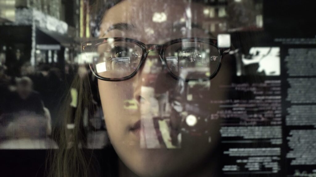
An asian woman concentrating on a touch screen display. The point of view is from behind the screen, looking through the data and images to the woman's face as she manipulates the windows of information.
Creative Strategy

The Science Behind Engaging Visuals

One of the fundamental ways to make sure your social media posts are getting engagement is to include visuals. Images, infographics, and videos are more likely to capture a person’s attention when compared to text. If your post doesn’t include visual content, it risks getting lost in people’s timelines amidst all of the posts that do include visuals. To illustrate this point, let’s explore the facts (yay, statistics!)

  • According to Buffer, Tweets with images are retweeted 150% more than Tweets without.
  • 74% of social media marketers use visual assets in their social media marketing, ahead of blogs (68%) and videos (60%).
  • Eye tracking studies performed by Nielsen Norman Group suggested that when people find images relevant, they spend more time looking at them on a webpage than reading the text.
Group of multicultural friends using smartphone outdoors - People hands addicted by mobile smart phone - Technology concept with connected men and women - Shallow depth of field on vintage filter tone

Bottom Line: Visuals. Use Them. Whether it’s a photo, an infographic, a video, or anything else!

But keep in mind, all visuals are not created equal, and there are things that make certain visuals more engaging than others. While these will differ depending on your industry (different audiences react differently to images), here are some general tips that are crucial when selecting visuals to include in your post:

1. Include Eyes

A tried and true method of getting people to stop at your image when scrolling through their newsfeeds is to include images where people appear to be staring at the viewer. Eye contact is a super engaging visual, and if your image draws eyes to your post, the viewer is more likely to stop, stare, and read your content.

This is a perfect example of an image where the entire visual appeal is based on eye contact.

woman's eyes

2. Include a Lot of Colours, when Appropriate

We generally recommend sticking to a similar colour scheme (preferably your brand colours) when creating images – in order to make sure people are able to quickly connect the visuals to your brand. However, visuals that include a variety of colours are more eye-catching than those with few colours. So, whichever colour scheme you choose, at the very least, avoid images with only shades or dark colours.

Good:

The picturesque Spirit Island is a world famous Canadian Rockies landmark on Maligne Lake, Jasper National Park, Alberta, Canada. In the background is part of the Hall of the Gods, with Mount Warren, Valad Peak, Mount Henry MacLeod, Coronet Glacier and Mount Mary Vaux visible.

Bad:

Residential buildings and the favela in the background

3. Design them for Easy Comprehension

Because the brain is able to quickly determine relationships between objects, people can create connections more quickly by looking at visuals than reading text. In the clever image below, Coke uses this idea to quickly teach people a new way of making iced tea – all without using a single word of text. Talk about taking advantage of the human brain!

4. Try Incorporating Humour

If you’re ever struggling to figure out how to connect with your audience, try using humour! Different types of people like different things, but a sense of humour is innate (we laugh even before we learn to talk).

Old Spice is a master at creating visuals that catch people’s eyes by using humour that’s immediately noticeable. This image is simple, creative, and effective!

5. Guide the Eyes with Lines

Using lines can help guide people’s eyes to sections of images that you want them to see. For example, try using lines to guide people’s eyes to an image labelled “call now” (or similar) – to direct their attention where you’d like it to be.

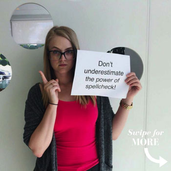
In the post below, we used arrows to encourage people to swipe left and see the next image in the post. This is perfect for Instagram, where you can include multiple photos in one post.

Treefrog Tip: When you are absolutely out of ideas for what visuals to include, or simply don’t have the resources to generate ones, use royalty-free image websites like Pixabay or PEXELS to search for images relevant to your post.

Keep in mind, you can’t always Google image search photos to include in your posts, as someone else may own the rights to them, and you may end up in trouble if you use them.

Need help creating eye-catching visuals that get noticed? Our graphic design and social media teams are made up of experts who understand the power of captivating imagery.

Request a free quote or give us a call at 905-836-4442 today!

Colour swatches
Marketing Strategy

Trade Show Booth: Get Results!

From concept to print and everything in between

Trade shows are an engaging opportunity to build your brand, meet with new prospects and strengthen your relationships with established clients. Often it is not taken into consideration the amount of time it takes to complete the process of conceptualizing, designing and printing of trade shows booths.

Because most industry trade shows are just that: a gathering of the industry, it is important to consider the competition and how to distinguish your business from them in such close quarters. Trade shows can play an extremely pivotal role in your business’ networking if you are able to make the right connections.

Remember it is imperative to think about your target audience and ask yourself if you are effectively communicating with them.

  • How can you best reach your target market?
  • What is the desired action of your target market?
  • How is your presence at the trade show going to affect your target market?
  • Does your booth coordinate with your branding & other marketing efforts?

A compelling, custom booth is a sure-fire way to stand out on the floor and increase foot traffic at a crowded trade show.

In order to achieve this goal, it all has to start weeks earlier in the planning stage. Better yet, let’s say plan months earlier, or as early as you can. This way you will be able to handle any unexpected hiccups or hurdles that are all too common on projects like this.

It all begins with a deadline. When is the booth needed? From there you begin communication with a printer to determine their requirements. Accordingly your design or marketing team work backwards from this date, if left too late and they only have a week, you are likely to be limited in our options. However if you have planned appropriately, there are a variety of innovative alternatives to explore, and you are able to create the right message and invest wisely.

Put simply; people are attracted to booths that look good. Investing some time and money into an appealing design will serve you well when you arrive at the show. You need to communicate visually to any potential visitors what your brand stands for and the message you are expressing. This result is not created plainly with a slogan printed on a 7-foot piece of vinyl but communicated through engaging colour, composition and typography in tandem with a solid marketing message.

There is a multitude of options and booth alternatives to explore and consider, including:

  • iPad stands
  • Video/TV displays
  • Presentation equipment
  • Furniture

How will visitors interact with you and the space?

This interaction is another important component to consider, as you want to make an impression not only immediately in person, but also when everybody returns home from the trade show and has time to reflect on the many choices they have to digest.

To ensure a lasting impact you may want to examine something tangible to send back with all of your new connections, such as:

  • Takeaway pieces
  • Business cards
  • Brochures
  • Giveaways

Even once you have your artwork finalized, the project is not complete.

It is then time to return to the printer in order to turn these digital files to a functioning exhibit. But this too, is not an overnight process. Just how long does it take to get a booth printed? This information varies from printer to printer, as well as depending on the time of the year. However, you could be looking at anywhere from one week to four weeks depending on the size and complexity of the booth as well as shipping times. Remember if you are looking to get a booth printed, it is likely that many other businesses in your industry are as well. You wouldn’t want to miss out on an effective booth because the printer couldn’t find the time to complete your job!

When time and finances are budgeted appropriately, an appearance at a trade show can often be a momentous networking opportunity, and exhibit a great return on your investment.

Need a hand determining a strategy for success at your upcoming trade show?

Treefrog is in the business of helping your business in situations just like this. Contact us today; we’re here to help!

A man's hands hold drawn mock ups of a website design
Creative Strategy

What is Graphic Design?

101 Information

Graphic design is art with a purpose. It involves a creative and systematic plan to solve a problem or achieve certain objectives, with the use of images, symbols or even words. It is visual communication and the aesthetic expression of concepts and ideas using various graphic elements and tools.

Elements of Graphic Design

Graphic design can use image-based designs involving photos, illustrations, logos and symbols, type-based designs, or a combination of both techniques. These designs can include various combinations of the following elements.

Lines: Straight, curved, wavy, thick, thin – when it comes to lines, the possibilities are limitless. Lines allow designers to divide a space or separate content in a layout. They can also be used to guide the eyes of the viewer, or make other elements follow a strategic path for added findability, to get the viewer easily from point A to point B.

Shapes: Shapes offer a variety of ways to fill spaces creatively, to support text and other forms of content, and to balance a design. Shapes can be created out of nothing, using white space to give a design structure and clarity.

Colour: Colour, or the absence of colour, is an important element of any visual design. With a solid understanding of colour theory, designers can amazingly influence a design and a brand, seamlessly integrating colour boldly or with brilliant subtlety.

Type: Type can transform a message from mere text to a work of art. Different fonts, combined with customized alignments, spacing, size, and colour, can add power to the point you are communicating to the world.

Texture: Even a smooth and glossy advertisement can seem tangible with texture. It gives a sense of a tactile surface through its visual appearance and adds a sense of depth, enhanced by selection of appropriate paper and material.

Tools of Graphic Design

Professional designers possess a creative mind with an artistic inclination, and so much more. Keen observation skills and analytical thinking are essential tools for graphic designers, before they dig into their physical tool kit and touch pen to paper or stylus to tablet. Designers employ a variety of methods to combine art and technology to communicate a particular message and create an impressive visual.

Sketchpads: A traditional tool used to sketch out ideas; it is the quickest way to jot down the rough designs, which designers can develop further using other tools and technologies.

Computers: Computers now occupy an essential place in every designer’s tool kit. Hardware such as tablets allow designers to expand their creative freedom and maintain that sketchpad feel while creating a digital design.

Software: Technology has opened new doors for realizing creative vision. Specialized software such as Illustrator and Photoshop can help to create illustrations, enhance photographs, stylize text, and synergize all of the pieces in incredible layouts.

Graphic Design communicates your brand and message visually with impressive business logos, enchanting brochures, newsletters with impact, and stunning posters.

Let the professional graphic designers at Treefrog Inc. turn your dreams and ideas into realistic revelations.

We have provided countless clients with beautiful, eye-catching graphic design work, but don’t just take our word for it! Let’s Talk.

Design process of a logo graphic
Brand Strategy

What’s in a logo

Logo design, and for that matter brand design, are not cookie-cutter solutions.

Sure, an agency can state that they have stock imagery that gets “close” to a logo design that captures the essence of your business. That’s like trying to be authentic by hanging a box-store piece of art in your living room, knowing that somewhere out there, thousands of other living rooms are donning the same badge of “authenticity”.

At Treefrog, we’re very passionate about design. It’s what makes us unique. Our attention to artistic creativity and visual impact is what sets us apart from other agencies.

We are also passionate about defending the work that goes into good design.

There’s been an emergence of online stock design companies recently. These companies create tension in the market because it makes people think that a brand is something you can just choose and move on. As if you could pick your corporate identity off a shelf and carry it to the checkout line.

Why You Should Invest In Your Logo

What’s in a logo, really? It’s just a graphic that identifies your company brand. What’s so complicated about that? Anyone can create a logo. Right?

Some may think so, but then you have to ask yourself why so many high profile companies spend so much on logo design.

What makes a powerful company logo? Why do some logos stick out from others? What makes us remember them? If they’re so simple that just anyone could do them, then why doesn’t every company have an unforgettable logo?

Consider that your logo is a tactical piece of a brand. A logo is not a brand. If a company comes to Treefrog asking for a new brand, expecting only a new logo, we’ll challenge their thinking.

The fact is, if your company is in need of a brand revamp, you’re not going to fix the problem with a logo. Don’t confuse an iconic symbol of your business as being the entirety of your brand identity. There’s far more to the concept of brand than a logo.

That is not to say that a logo is not an important part of your brand; quite the contrary. This is partly because of the fact that people can immediately tell a shoddy logo from one that’s quality. Your logo can immediately cause people to identify your company as either slapdash, or serious. That’s a pretty powerful sentiment to leave people with as a first impression.

Ideally, the logo will convey a feeling. Maybe it’s powerful enough to spark a memory. It needs the depth of meaning in order to foster an emotional attachment with people.

Keep in mind that a brand encapsulates all the pieces that a company uses to communicate with the world; from business cards, letterhead, brochures, colour uses, typography and image choice. A logo is just the tip of the iceberg when it comes to establishing a brand.

The Potato Factor

Gaby Hart, a faculty member at Georgian College for design, summed up logo design succinctly by saying: “A logo is a mark that a company can be remembered by; it should be so simple that you could draw it in the sand with a stick.”

In a similar vein, at Treefrog, we say that you should be able to cut your logo out of a potato. Think of all the things you want to do with your logo—feature it on print pages, your website, have it emblazoned on T-shirts and display it on trade show booth signs that need to be visible from hundreds of yards away. Who knows, you may actually want to have your logo in potato form.

Your logo should be able to stand out in a group of other logos listed on a partner webpage. It should be clear, definitive, and identifiable. There’s a lot of thinking that goes into the development of a logo, word mark or brand identity.

One of the many things we pride ourselves on as an agency is our personal touch. We want to spend time with you to understand your business and how you operate. Is the cost going to be higher than simply picking a logo off a shelf of dozens more like it? Sure. But you get the benefit of a team of experienced designers working with you on your brand rejuvenation.

We want to show off your logo as an emblem of our successful partnership. After all, the best logo designs are derived from collaboration, and a deep understanding of what makes your company unique.

Online Agencies: The Bargain Bin of Logo Design

Some wonder why there are agencies who charge premium amounts for logo design, when there are companies on the web kicking them out for a hundred bucks a piece. The question usually gets around to: what are you actually paying for in a logo design?

First of all, your business has its own unique identity, something that gives people the perception of character. You’ve put time and energy into your business and your brand. Would you really want to hire a stock logo company to shoehorn a look into your corporate identity? Think of it this way: who would you rather have write your autobiography, someone you know, or someone you just found online?

When your company wants a new logo, you have a few options.

1) You can go to a stock logo company.

Right away, the terms, conditions and deliverables are likely going to be different for each one you find. These companies often offer a fast turn around, and a handful of concepts for you to choose from. They may also allow you to make a number of revisions, depending on the price level you choose. Once approved, your logo may be sent to you in a variety of file formats that you will need for printing.

Where you may run into trouble: these are often online companies, i.e. they may not be locally based, so you can’t pop over to discuss your concept with the designer. They may even be in a completely different country, and there may be a language barrier. Discussing logos can often be a very abstract process and be quite an emotional experience. Email often doesn’t work when conveying emotion. Clients often cannot easily verbalize what is bugging them about a concept. A face-to-face meeting with a designer who can help you through the design jargon to focus in on the key areas can be very useful. Furthermore, with an online stock logo company, once you’ve maxed out your number of revisions, that’s it. If you’re not happy, then you have to pay for more revisions.

2) You can use a competitive design website.

These are sites where a client can post their project and the specifications and state how much they want to pay the designer. Designers then can “bid” on the job and post their ideas. After a predefined amount of time, the client then chooses which design they like most, pay the designer and the logo file is supplied.

Again, there are problems inherent in this method. This puts a lot of responsibility in the client’s hand, they have to be able to cohesively communicate the requirements of the project to a broad audience. A lot of people aren’t creatively minded, nor do they really know how to communicate what they really want. What you put in the brief will be taken literally by the designers on the site. If you’re not clear on what you want, then it’s highly likely that you won’t get what you want.

Also, since graphic design is not currently regulated by an authoritative body that checks that designers are at a particular level, ANYONE can post a design on a competitive design website. There is no regulation for quality or skill level. You may have to scroll through thousands of sub-par designs in the hope of finding your new logo. What if no one submits a design in response to your brief? That logo you desperately need will not get done until a designer, wherever they may be in the world, decides to do it.

As for revisions, it all depends on whether they were negotiated when you submitted the brief. The designer may provide the logo “as is” in which case you’d better be happy with what you got. Who knows whether the artwork file will even be constructed properly for a printer?

Here’s an analogy: imagine having a plumbing issue in your house. You know what’s wrong, but you don’t know the source of the problem. You describe the issue to the best of your ability on a website, say how much you’re willing to pay, and hit “submit”. Then you sit and wait for a plumber to come fix your problem. When (or more accurately if) that plumber arrives, you have no idea of their skill level, whether they are a legitimate plumber (maybe they do it part-time, maybe they’re a student!), whether they have any work experience and if they even know what they’re doing. The end result? Your plumbing issue might be fixed, or it might not, and you may have just flooded your house and be down $500.

3) You work with Treefrog or another Graphic Design/Branding company.

First off, you can go look at our website, get to know us, look at our portfolio of work, come meet with us and check that we’re real human beings. If you’re then happy to partner with us, you’ll soon be sitting down with our Art Director and a Designer to discuss your new logo, and the goals of your project. This is usually an in-person meeting and can be an hour or more of in-depth discussion about your company, your long term and short term goals, your likes and dislikes as well as your target market and applications.

After this meeting our designers will work on your logo. We have a team of designers and we will often work collaboratively on a project to refine ideas and come up with a wide range of concepts. Our designers have all had at minimum four years of Graphic Design training prior to working with Treefrog, and are all Graduates of recognized educational institutions. Our designers also have a wide range of skills, with backgrounds in illustration, fashion design, and editorial design—not to mention being skilled web designers. Our Art Director will work with the design team to refine your logo concepts until we’re sure they’re at the level of excellence that we aspire to here at Treefrog. These concepts will take into account your target market, the goals and future extensibility of the brand as well as adaptations for alternative printing techniques (such an embroidering on a T-shirt).

After presenting you with the concepts, we will plan another meeting, sometimes over the phone or in person (your choice) to discuss your thoughts on the presented ideas. We will then work closely with you to refine the logo concept to the final piece, until you are 100% happy. After the logo is approved we will save out a wide range of file formats and colour options to suit most, if not all possible ways that you may need the logo in the future. If you lose these files, we’ll always have backups to send to you if you need them.

At Treefrog, personality is very important. We know your company has a story, and we’d love to help you tell it. We also know that budget is a factor. But the good thing about working with an actual agency, is that we can work with you directly, and not expect you to have to conform to a rigid price structure or process for what should be a rewarding creative experience.

The point is, a brand and a logo are made up of so much more than just a stock image or your company name in a font.

What’s in a logo? You are.

Cropped close up of a woman's face
Creative Strategy

Professional Imagery: Why it is Important for Your Website

As much as we all loathe to admit it, let’s face it: appearance is everything.

Humans are visual creatures hence what others see has an undeniable impact on our success. Images transcend language and words and allow for a greater understanding of whatever is being discussed. Since first impressions are formed within seconds and since most of the information we consume and interpret is visual, quality design can make your site and your brand stick in the viewer’s mind as professional and credible. This article will discuss why we’re image based, how you can benefit from this knowledge and what constitutes as a well-designed site.

Why are we so Image Based?

Our minds react differently to visual stimuli because the human brain deciphers image elements instantly, while language is decoded in a linear, sequential manner taking more time to process. Studies tell us that 90% of information transmitted to the brain is visual, and visuals are processed 60,000 times faster in the brain than text. “Seeing comes before words. The child looks and recognizes before it can speak” (Berger, Ways of Seeing, 1972). So unless our words, concepts, ideas are hooked onto an image, they will go in one ear, sail through the brain, and go out the other ear.

How can we Benefit?

A professional, modern looking website can immediately build trust and guide visitors to take action. When it comes to web copy, people rarely read a piece of content word for word. On the other hand, images stick with readers longer and are more likely to give you a greater return on your content investment. The design of a website is significant because it affects how quickly visitors can find what they are looking for. If navigating the website is difficult or frustrating, the visitor will leave and try on another site, resulting in a lost opportunity. A good design will be easy to understand and navigate, helping potential customers find what they need and taking you one step closer to making a sale or getting in touch.

What Constitutes a Good Design?

Effective design should convey a message, tell a story, and allow anyone to understand what you’re talking about. Several factors such as consistency, colours, photos and simplicity all contribute to a well designed site.

I Want My Site to Look Like Apple

A common request we get via our design questionnaires is; “I want my site to look like Apple’s”. So many people ask this because Apple Inc. is pretty much synonymous with classy design. Why does Apple’s design work? Here are just a few reasons:

Simplicity: Take a look at Apple’s homepage and don’t think about what you see, but what you don’t see. The answer of course is visual clutter. Specifically the homepage, which simply shows off their most recent work and provides you with a few easily understood categories to help you get to the information you want to see. Even if your company is not as ubiquitous, you can still use minimal but attractive design to increase usability.

Stunning product shots: One of Apple’s principle reasons for cutting back on superfluous graphics on their site is to really showcase what’s important: their products. Just look at the shots they use; it’s nearly impossible to look at a page on the Apple site and not have your eyes focus on the products for seconds on end. There are several things that make these products look so incredible. The first is that they are obviously pristine. Chalk this one up to digital imaging experts. The combination is a mixture of photography, 3D modeling and Photoshop. The next thing they do is to make them take up a huge portion of the page, which are overwhelmingly impressive.

Consistency: Apple’s general look or “brand essence” is applied across every single thing they design. It’s quite stunning when you realize how much their software actually looks like their hardware. You can’t get much more integrated.

Details: Apple is all about attention to detail. Every little piece of their site is finessed into perfection. Never fall into the trap of saying “no one will notice” or “good enough.” It is often the margin of time spent on the tiniest details that separate the good websites from the great ones.

Strong grid: Every page on Apple’s site adheres to a strict grid structure; whether simple or complicated, it’s there. There is a ton going on, but it somehow seems attractive instead of overwhelming. Breaking sporadic information up into manageable cells drastically reduces visual clutter and confusion.

Go Pro

Professional images capture authenticity. Photographs not only show the visitor what you offer, but can also make them want to act. People no longer just want to browse a website, they want to experience it. The bakery website www.cookieitup.com is full of quality, wholesome images of fresh cookies and natural ingredients. The tantalizing photos and custom illustrations make one want to rush over and buy a box (or five). A personal touch is the result which really speaks to the handmade aspect of the products. The simplicity and consistency of the images speaks to the quality of the product.

It’s simple: the more professional, compelling and enticing your site’s photography is, the more business you’ll conduct over time. We’re not just talking about pretty pictures, we’re talking about a way to visualize information in a simple way that makes sense to the client. Using good photography of your products and services will help you market to a much larger audience. Photos open your content up to a whole new audience through giving visitors the chance to share your imagery with friends and family. Bonus: shared images are basically free advertising. Professional photos can make your visitor understand your product or service more.

Stock Photography

The key to using stock photography is searching for unique and compelling images that are relevant to your brand and your message without looking cliché. Using the site www.octacom.ca as an example, we immediately recognize what the business does, based on the images alone. Depending on your budget you can choose to use all professional, all stock imagery or a mixture of both.

Team Photos Convey Culture and Consistency

Hiring a professional to take photos of your team in action will get you authentic results that will convey company culture and consistency. Your face is part of your brand, so a professional head shot will not only look flattering, but will also make your customer see you as more trustworthy, sincere, and well-practiced. These photos can also be used in places other than your website. You can use them all over your personal and professional social media accounts, such as LinkedIn and Facebook where profile pictures matter most.

If you are striving to be professional and knowledgeable in the workplace, then your website needs to reflect that. Using great design and quality photography is a necessity in this visual world. Great design should convey a message in an easy, simple way, transcend language barriers, provide a good summary of information, support and break down complex concepts, and take a fraction of a second to understand.

The next time you’re tempted to skimp on the professional graphic design, bear in mind that images go directly into long-term memory (words are processed by our short-term memory). They can be called upon when thinking about a particular business or company. Make sure your business conjures great images along with compelling content. Recognizing the importance of visual communication for your site is key to your success.

Scroll to Top